
A graph of our sensor values changing over time is the most effective way to understand what is happening in the home environment. We need 2 new controller files: sampler.py and sampler_helpers.py
wget -nH -x --cut-dirs=3 -P /usr/local/bin/code/controller/ -i /usr/local/bin/code/controller/manifest2.txt http://www.warrensoft.co.uk/home-hub/manifests/controller/manifest2.txt
Edit existing main_sched.py and uncomment the sampler import on line 27 and the call to process_samples on line 194. Restart the controller.
Edit your sensors and set the Sample Type to Raw. Raw is the only sample mode currently implemented, which just records the current value, but future options might include smoothing or prediction.
Fetch the files for the website…
wget -nH --cut-dirs=4 --reject "index.html*" -P /var/www/html/ -i /var/www/html/manifest4.txt http://www.warrensoft.co.uk/home-hub/manifests/website/manifest4.txt
comparisonGraphs groups sensors by measurand, and draws a graph for each group.
getComparisonChartData is responsible for supplying the data in the form of a json table
Checkout the documentation and examples at https://developers.google.com/chart/ for more information.
If everything is working you should now be seeing some graphs when you select Comparison Graphs on the website!
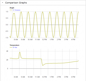
A few features to note with graphs:
1. You can hover over a trace to pop-up a box showing the value at that time
2. You can click the time-base axis and cycle through various time-spans. The default is 24 hours, and the longest is 96 hours
3. Graphs auto-refresh.
To prevent the database from growing too big there is a main_sched task that truncates samples. This will become available when we implement the monitor module later.
In the next post we will add an actuator so we can control some plant.